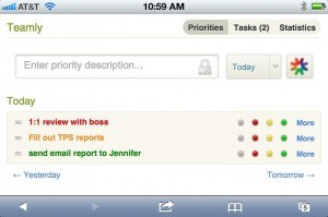
Here’s a list of just some of the changes: New user interface Teamly’s new interface allows users to now see their top priorities, tasks for later and also leftover items — all on one page. In addition, they can see them using separate views for the day, week, month, or quarter. The Overview feature lets you look at everything on one page, which helps you plan. — although users who preferred the Classic view can still use it. Visibility The new news feed makes it even easier to see what colleagues are working on. Users can still access teams using the previous navigation method, but the news feed allows for users to quickly glance and see what’s going on. It also provides direct links to comment on an item, which is handy to keep the lines of communication open and workflow at an optimum. Mobile Your mobile phone displays an optimized view of Teamly — one that loads faster and eliminates a lot of non-essential stuff. That means a better mobile experience and less clutter to boot.
For those who also use Yammer, they can now share individual accomplishments with colleagues on their company’s Yammer network. Once something is marked as complete, they can click on the Yammer icon that appears afterward. Share your progress anytime Users can create “report cards” that show what they’ve done, and can share them with colleagues on Yammer, by email, or even externally on public social networks including Facebook and Twitter. They only need to simply click on the “Create Report” button, which is located just above the Priority list. Want to get started with Teamly? Head over to the Teamly website and you’re on you way.

